Panels Overview
Panel elements are components that control the rendering of elements - their size and dimensions, their position, and the arrangement of their child content. Avalonia UI provides a number of predefined Panel elements as well as the ability to construct custom Panel elements.
The Panel Class
Panel is the base class for all elements that provide layout support in Avalonia. Derived Panel elements are used to position and arrange elements in XAML and code.
Avalonia includes a comprehensive suite of derived panel implementations that enable many complex layouts. These derived classes expose properties and methods that enable most standard UI scenarios. Developers who are unable to find a child arrangement behavior that meets their needs can create new layouts by overriding the ArrangeOverride and MeasureOverride methods. For more information on custom layout behaviors, see Create a Custom Panel.
Panel Common Members
All Panel elements support the base sizing and positioning properties defined by Control, including Height, Width, HorizontalAlignment, VerticalAlignment and Margin. For additional information on positioning properties defined by Control, see Alignment, Margins, and Padding Overview.
Panel exposes additional properties that are of critical importance in understanding and using layout. The Background property is used to fill the area between the boundaries of a derived panel element with a Brush. Children represents the child collection of elements that the Panel is comprised of.
Attached Properties
Derived panel elements make extensive use of attached properties. An attached property is a specialized form of dependency property that does not have the conventional common language runtime (CLR) property "wrapper". Attached properties have a specialized syntax in XAML, which can be seen in several of the examples that follow.
One purpose of an attached property is to allow child elements to store unique values of a property that is actually defined by a parent element. An application of this functionality is having child elements inform the parent how they wish to be presented in the UI, which is extremely useful for application layout.
User Interface Panels
There are several panel classes available in Avalonia that are optimized to support UI scenarios: Panel, Canvas, DockPanel, Grid, StackPanel, WrapPanel and RelativePanel. These panel elements are easy to use, versatile, and extensible enough for most applications.
Canvas
The Canvas element enables positioning of content according to absolute x- and y- coordinates. Elements can be drawn in a unique location; or, if elements occupy the same coordinates, the order in which they appear in markup determines the order in which the elements are drawn.
Canvas provides the most flexible layout support of any Panel. Height and Width properties are used to define the area of the canvas, and elements inside are assigned absolute coordinates relative to the area of the parent Canvas. Four attached properties, Canvas.Left, Canvas.Top, Canvas.Right and Canvas.Bottom, allow fine control of object placement within a Canvas, allowing the developer to position and arrange elements precisely on the screen.
ClipToBounds Within a Canvas
Canvas can position child elements at any position on the screen, even at coordinates that are outside of its own defined Height and Width. Furthermore, Canvas is not affected by the size of its children. As a result, it is possible for a child element to overdraw other elements outside the bounding rectangle of the parent Canvas. The default behavior of a Canvas is to allow children to be drawn outside the bounds of the parent Canvas. If this behavior is undesirable, the ClipToBounds property can be set to true. This causes Canvas to clip to its own size. Canvas is the only layout element that allows children to be drawn outside its bounds.
Defining and Using a Canvas
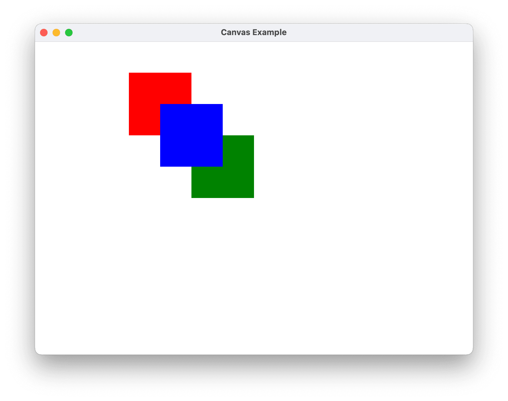
A Canvas can be instantiated simply by using XAML or code. The following example demonstrates how to use Canvas to absolutely position content. This code produces three 100-pixel squares. The first square is red, and its top-left (x, y) position is specified as (0, 0). The second square is green, and its top-left position is (100, 100), just below and to the right of the first square. The third square is blue, and its top-left position is (50, 50), thus encompassing the lower-right quadrant of the first square and the upper-left quadrant of the second. Because the third square is laid out last, it appears to be on top of the other two squares—that is, the overlapping portions assume the color of the third box.
- XAML
- C#
<Canvas Height="400" Width="400">
  <Canvas Height="100" Width="100" Top="0" Left="0" Background="Red"/>
  <Canvas Height="100" Width="100" Top="100" Left="100" Background="Green"/>
  <Canvas Height="100" Width="100" Top="50" Left="50" Background="Blue"/>
</Canvas>
// Create the Canvas
myParentCanvas = new Canvas();
myParentCanvas.Width = 400;
myParentCanvas.Height = 400;

// Define child Canvas elements
myCanvas1 = new Canvas();
myCanvas1.Background = Brushes.Red;
myCanvas1.Height = 100;
myCanvas1.Width = 100;
Canvas.SetTop(myCanvas1, 0);
Canvas.SetLeft(myCanvas1, 0);

myCanvas2 = new Canvas();
myCanvas2.Background = Brushes.Green;
myCanvas2.Height = 100;
myCanvas2.Width = 100;
Canvas.SetTop(myCanvas2, 100);
Canvas.SetLeft(myCanvas2, 100);

myCanvas3 = new Canvas();
myCanvas3.Background = Brushes.Blue;
myCanvas3.Height = 100;
myCanvas3.Width = 100;
Canvas.SetTop(myCanvas3, 50);
Canvas.SetLeft(myCanvas3, 50);

// Add child elements to the Canvas' Children collection
myParentCanvas.Children.Add(myCanvas1);
myParentCanvas.Children.Add(myCanvas2);
myParentCanvas.Children.Add(myCanvas3);
DockPanel
The DockPanel element uses the DockPanel.Dock attached property as set in child content elements to position content along the edges of a container. When DockPanel.Dock is set to Top or Bottom, it positions child elements above or below each other. When DockPanel.Dock is set to Left or Right, it positions child elements to the left or right of each other. The LastChildFill property determines the position of the final element added as a child of a DockPanel.
You can use DockPanel to position a group of related controls, such as a set of buttons. Alternately, you can use it to create a "paned" UI.
Sizing to Content
If its Height and Width properties are not specified, DockPanel sizes to its content. The size can increase or decrease to accommodate the size of its child elements. However, when these properties are specified and there is no longer room for the next specified child element, DockPanel does not display that child element or subsequent child elements and does not measure subsequent child elements.
LastChildFill
By default, the last child of a DockPanel element will "fill" the remaining, unallocated space. If this behavior is not desired, set the LastChildFill property to false.
Defining and Using a DockPanel
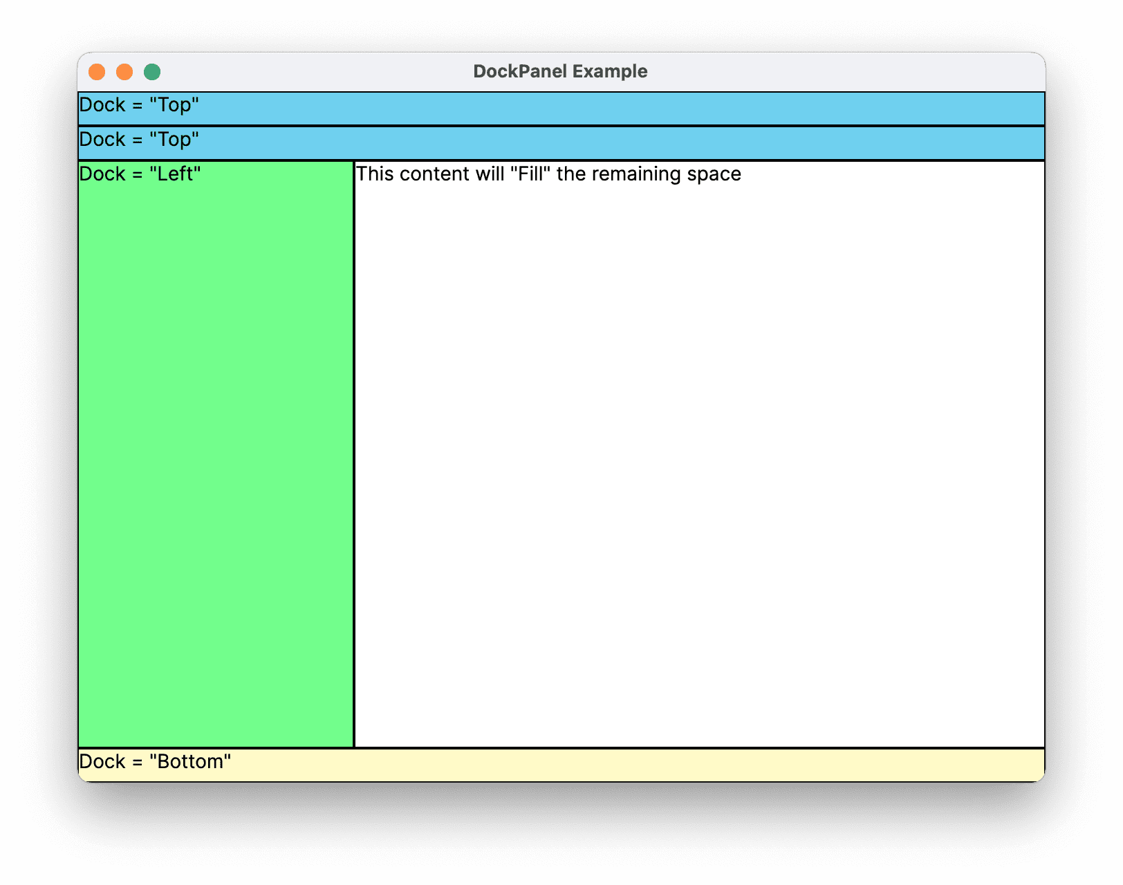
The following example demonstrates how to partition space using a DockPanel. Five Border elements are added as children of a parent DockPanel. Each uses a different positioning property of a DockPanel to partition space. The final element "fills" the remaining, unallocated space.
- XAML
- C#
<DockPanel LastChildFill="True">
  <Border Height="25" Background="SkyBlue" BorderBrush="Black" BorderThickness="1" DockPanel.Dock="Top">
    <TextBlock Foreground="Black">Dock = "Top"</TextBlock>
  </Border>
  <Border Height="25" Background="SkyBlue" BorderBrush="Black" BorderThickness="1" DockPanel.Dock="Top">
    <TextBlock Foreground="Black">Dock = "Top"</TextBlock>
  </Border>
  <Border Height="25" Background="LemonChiffon" BorderBrush="Black" BorderThickness="1" DockPanel.Dock="Bottom">
    <TextBlock Foreground="Black">Dock = "Bottom"</TextBlock>
  </Border>
  <Border Width="200" Background="PaleGreen" BorderBrush="Black" BorderThickness="1" DockPanel.Dock="Left">
    <TextBlock Foreground="Black">Dock = "Left"</TextBlock>
  </Border>
  <Border Background="White" BorderBrush="Black" BorderThickness="1">
    <TextBlock Foreground="Black">This content will "Fill" the remaining space</TextBlock>
  </Border>
</DockPanel>
// Create the DockPanel
DockPanel myDockPanel = new DockPanel();
myDockPanel.LastChildFill = true;

// Define the child content
Border myBorder1 = new Border();
myBorder1.Height = 25;
myBorder1.Background = Brushes.SkyBlue;
myBorder1.BorderBrush = Brushes.Black;
myBorder1.BorderThickness = new Thickness(1);
DockPanel.SetDock(myBorder1, Dock.Top);
TextBlock myTextBlock1 = new TextBlock();
myTextBlock1.Foreground = Brushes.Black;
myTextBlock1.Text = "Dock = Top";
myBorder1.Child = myTextBlock1;

Border myBorder2 = new Border();
myBorder2.Height = 25;
myBorder2.Background = Brushes.SkyBlue;
myBorder2.BorderBrush = Brushes.Black;
myBorder2.BorderThickness = new Thickness(1);
DockPanel.SetDock(myBorder2, Dock.Top);
TextBlock myTextBlock2 = new TextBlock();
myTextBlock2.Foreground = Brushes.Black;
myTextBlock2.Text = "Dock = Top";
myBorder2.Child = myTextBlock2;

Border myBorder3 = new Border();
myBorder3.Height = 25;
myBorder3.Background = Brushes.LemonChiffon;
myBorder3.BorderBrush = Brushes.Black;
myBorder3.BorderThickness = new Thickness(1);
DockPanel.SetDock(myBorder3, Dock.Bottom);
TextBlock myTextBlock3 = new TextBlock();
myTextBlock3.Foreground = Brushes.Black;
myTextBlock3.Text = "Dock = Bottom";
myBorder3.Child = myTextBlock3;

Border myBorder4 = new Border();
myBorder4.Width = 200;
myBorder4.Background = Brushes.PaleGreen;
myBorder4.BorderBrush = Brushes.Black;
myBorder4.BorderThickness = new Thickness(1);
DockPanel.SetDock(myBorder4, Dock.Left);
TextBlock myTextBlock4 = new TextBlock();
myTextBlock4.Foreground = Brushes.Black;
myTextBlock4.Text = "Dock = Left";
myBorder4.Child = myTextBlock4;

Border myBorder5 = new Border();
myBorder5.Background = Brushes.White;
myBorder5.BorderBrush = Brushes.Black;
myBorder5.BorderThickness = new Thickness(1);
TextBlock myTextBlock5 = new TextBlock();
myTextBlock5.Foreground = Brushes.Black;
myTextBlock5.Text = "This content will Fill the remaining space";
myBorder5.Child = myTextBlock5;

// Add child elements to the DockPanel Children collection
myDockPanel.Children.Add(myBorder1);
myDockPanel.Children.Add(myBorder2);
myDockPanel.Children.Add(myBorder3);
myDockPanel.Children.Add(myBorder4);
myDockPanel.Children.Add(myBorder5);
Grid
The Grid element merges the functionality of an absolute positioning and tabular data control. A Grid enables you to easily position and style elements. Grid allows you to define flexible row and column groupings, and even provides a mechanism to share sizing information between multiple Grid elements.
Sizing Behavior of Columns and Rows
Columns and rows defined within a Grid can take advantage of Star sizing in order to distribute remaining space proportionally. When Star is selected as the Height or Width of a row or column, that column or row receives a weighted proportion of remaining available space. This is in contrast to Auto, which will distribute space evenly based on the size of the content within a column or row. This value is expressed as * or 2* when using XAML. In the first case, the row or column would receive one times the available space, in the second case, two times, and so on. By combining this technique to proportionally distribute space with a HorizontalAlignment and VerticalAlignment value of Stretch it is possible to partition layout space by percentage of screen space. Grid is the only layout panel that can distribute space in this manner.
Defining and Using a Grid
The following example demonstrates how to build a UI similar to that found on the Run dialog available on the Windows Start menu.
- XAML
- C#
<Grid Background="Gainsboro"
      HorizontalAlignment="Left"
      VerticalAlignment="Top"
      Width="425"
      Height="165"
      ColumnDefinitions="Auto,*,*,*,*"
      RowDefinitions="Auto,Auto,*,Auto">

    <Image Grid.Row="0" Grid.Column="0" Source="{Binding runicon}" />

    <TextBlock Grid.Row="0" Grid.Column="1" Grid.ColumnSpan="4"
               Text="Type the name of a program, folder, document, or Internet resource, and Windows will open it for you."
               TextWrapping="Wrap" />

    <TextBlock Grid.Row="1" Grid.Column="0" Text="Open:" />

    <TextBox Grid.Row="1" Grid.Column="1" Grid.ColumnSpan="5" />

    <Button Grid.Row="3" Grid.Column="2" Content="OK" Margin="10,0,10,15" />

    <Button Grid.Row="3" Grid.Column="3" Content="Cancel" Margin="10,0,10,15" />

    <Button Grid.Row="3" Grid.Column="4" Content="Browse ..." Margin="10,0,10,15" />
</Grid>
// Create the Grid.
grid1 = new Grid ();
grid1.Background = Brushes.Gainsboro;
grid1.HorizontalAlignment = HorizontalAlignment.Left;
grid1.VerticalAlignment = VerticalAlignment.Top;
grid1.ShowGridLines = true;
grid1.Width = 425;
grid1.Height = 165;

// Define the Columns.
colDef1 = new ColumnDefinition();
colDef1.Width = new GridLength(1, GridUnitType.Auto);
colDef2 = new ColumnDefinition();
colDef2.Width = new GridLength(1, GridUnitType.Star);
colDef3 = new ColumnDefinition();
colDef3.Width = new GridLength(1, GridUnitType.Star);
colDef4 = new ColumnDefinition();
colDef4.Width = new GridLength(1, GridUnitType.Star);
colDef5 = new ColumnDefinition();
colDef5.Width = new GridLength(1, GridUnitType.Star);
grid1.ColumnDefinitions.Add(colDef1);
grid1.ColumnDefinitions.Add(colDef2);
grid1.ColumnDefinitions.Add(colDef3);
grid1.ColumnDefinitions.Add(colDef4);
grid1.ColumnDefinitions.Add(colDef5);

// Define the Rows.
rowDef1 = new RowDefinition();
rowDef1.Height = new GridLength(1, GridUnitType.Auto);
rowDef2 = new RowDefinition();
rowDef2.Height = new GridLength(1, GridUnitType.Auto);
rowDef3 = new RowDefinition();
rowDef3.Height = new GridLength(1, GridUnitType.Star);
rowDef4 = new RowDefinition();
rowDef4.Height = new GridLength(1, GridUnitType.Auto);
grid1.RowDefinitions.Add(rowDef1);
grid1.RowDefinitions.Add(rowDef2);
grid1.RowDefinitions.Add(rowDef3);
grid1.RowDefinitions.Add(rowDef4);

// Add the Image.
img1 = new Image();
img1.Source = runicon;
Grid.SetRow(img1, 0);
Grid.SetColumn(img1, 0);

// Add the main application dialog.
txt1 = new TextBlock();
txt1.Text = "Type the name of a program, folder, document, or Internet resource, and Windows will open it for you.";
txt1.TextWrapping = TextWrapping.Wrap;
Grid.SetColumnSpan(txt1, 4);
Grid.SetRow(txt1, 0);
Grid.SetColumn(txt1, 1);

// Add the second text cell to the Grid.
txt2 = new TextBlock();
txt2.Text = "Open:";
Grid.SetRow(txt2, 1);
Grid.SetColumn(txt2, 0);

// Add the TextBox control.
tb1 = new TextBox();
Grid.SetRow(tb1, 1);
Grid.SetColumn(tb1, 1);
Grid.SetColumnSpan(tb1, 5);

// Add the buttons.
button1 = new Button();
button2 = new Button();
button3 = new Button();
button1.Content = "OK";
button2.Content = "Cancel";
button3.Content = "Browse ...";
Grid.SetRow(button1, 3);
Grid.SetColumn(button1, 2);
button1.Margin = new Thickness(10, 0, 10, 15);
button2.Margin = new Thickness(10, 0, 10, 15);
button3.Margin = new Thickness(10, 0, 10, 15);
Grid.SetRow(button2, 3);
Grid.SetColumn(button2, 3);
Grid.SetRow(button3, 3);
Grid.SetColumn(button3, 4);

grid1.Children.Add(img1);
grid1.Children.Add(txt1);
grid1.Children.Add(txt2);
grid1.Children.Add(tb1);
grid1.Children.Add(button1);
grid1.Children.Add(button2);
grid1.Children.Add(button3);
StackPanel
A StackPanel enables you to "stack" elements in an assigned direction. The default stack direction is vertical. The Orientation property can be used to control content flow.
StackPanel vs. DockPanel
Although DockPanel can also "stack" child elements, DockPanel and StackPanel do not produce analogous results in some usage scenarios. For example, the order of child elements can affect their size in a DockPanel but not in a StackPanel. This is because StackPanel measures in the direction of stacking at PositiveInfinity, whereas DockPanel measures only the available size.
Defining and Using a StackPanel
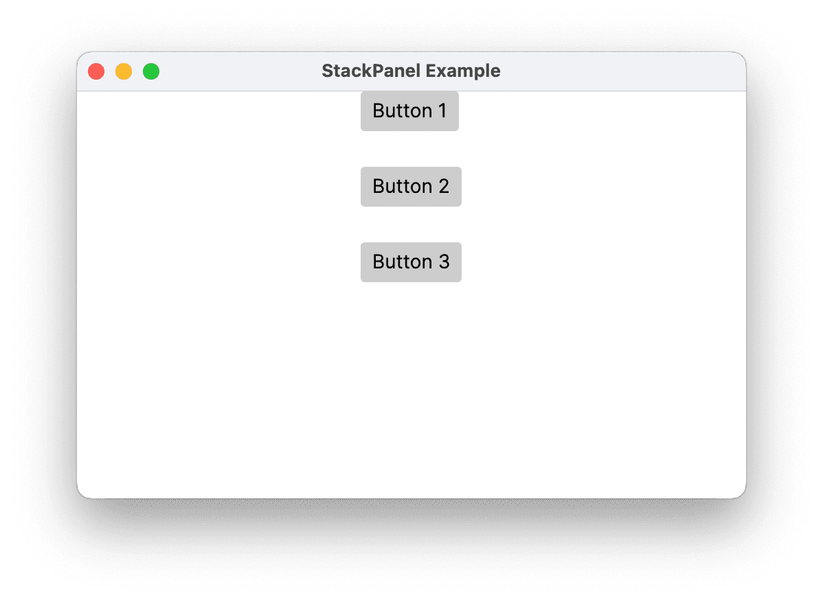
The following example demonstrates how to use a StackPanel to create a set of vertically-positioned buttons. For horizontal positioning, set the Orientation property to Horizontal.
- XAML
- C#
 <StackPanel HorizontalAlignment="Center"
                VerticalAlignment="Top"
                Spacing="25">
        <Button Content="Button 1" />
        <Button Content="Button 2" />
        <Button Content="Button 3" />
    </StackPanel>
// Define the StackPanel
myStackPanel = new StackPanel();
myStackPanel.HorizontalAlignment = HorizontalAlignment.Center;
myStackPanel.VerticalAlignment = VerticalAlignment.Top;
myStackPanel.Spacing = 25;

// Define child content
Button myButton1 = new Button();
myButton1.Content = "Button 1";
Button myButton2 = new Button();
myButton2.Content = "Button 2";
Button myButton3 = new Button();
myButton3.Content = "Button 3";

// Add child elements to the parent StackPanel
myStackPanel.Children.Add(myButton1);
myStackPanel.Children.Add(myButton2);
myStackPanel.Children.Add(myButton3);
WrapPanel
WrapPanel is used to position child elements in sequential position from left to right, breaking content to the next line when it reaches the edge of its parent container. Content can be oriented horizontally or vertically. WrapPanel is useful for simple flowing UI scenarios. It can also be used to apply uniform sizing to all of its child elements.
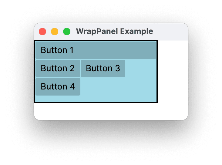
The following example demonstrates how to create a WrapPanel to display Button controls that wrap when they reach the edge of their container.
- XAML
- C#
<Border HorizontalAlignment="Left" VerticalAlignment="Top" BorderBrush="Black" BorderThickness="2">
  <WrapPanel Background="LightBlue" Width="200" Height="100">
    <Button Width="200">Button 1</Button>
    <Button>Button 2</Button>
    <Button>Button 3</Button>
    <Button>Button 4</Button>
  </WrapPanel>
</Border>
// Instantiate a new WrapPanel and set properties
myWrapPanel = new WrapPanel();
myWrapPanel.Background = System.Windows.Media.Brushes.Azure;
myWrapPanel.Orientation = Orientation.Horizontal;
myWrapPanel.Width = 200;
myWrapPanel.HorizontalAlignment = HorizontalAlignment.Left;
myWrapPanel.VerticalAlignment = VerticalAlignment.Top;

// Define 3 button elements. The last three buttons are sized at width
// of 75, so the forth button wraps to the next line.
btn1 = new Button();
btn1.Content = "Button 1";
btn1.Width = 200;
btn2 = new Button();
btn2.Content = "Button 2";
btn2.Width = 75;
btn3 = new Button();
btn3.Content = "Button 3";
btn3.Width = 75;
btn4 = new Button();
btn4.Content = "Button 4";
btn4.Width = 75;

// Add the buttons to the parent WrapPanel using the Children.Add method.
myWrapPanel.Children.Add(btn1);
myWrapPanel.Children.Add(btn2);
myWrapPanel.Children.Add(btn3);
myWrapPanel.Children.Add(btn4);
Nested Panel Elements
Panel elements can be nested within each other in order to produce complex layouts. This can prove very useful in situations where one Panel is ideal for a portion of a UI, but may not meet the needs of a different portion of the UI.
There is no practical limit to the amount of nesting that your application can support, however, it is generally best to limit your application to only use those panels that are actually necessary for your desired layout. In many cases, a Grid element can be used instead of nested panels due to its flexibility as a layout container. This can increase performance in your application by keeping unnecessary elements out of the tree.
UniformGrid
The UniformGrid is a type of Panel that provides uniform grid layout. This means that it lays out its children in a grid where all cells in the grid have the same size. Unlike the standard Grid, UniformGrid doesn't support explicit rows and columns, nor does it provide the Grid.Row or Grid.Column attached properties.
The primary use case for a UniformGrid is when you need to display a collection of items in a grid format where each item takes up an equal amount of space.
UniformGrid Properties
- Rows and Columns: The
UniformGriduses theRowsandColumnsproperties to determine the layout of its child elements. If you only set one of these properties, theUniformGridwill automatically calculate the other to create a grid that fits the total number of child elements. If you don't set either property, theUniformGriddefaults to a 1x1 grid.
For example, if you have 12 items and set Rows to 3, the UniformGrid will automatically create 4 columns. If you set Columns to 4, it will automatically create 3 rows.
- FirstColumn: The
FirstColumnproperty allows you to leave a certain number of cells empty in the first row of the grid.
Defining and Using a UniformGrid
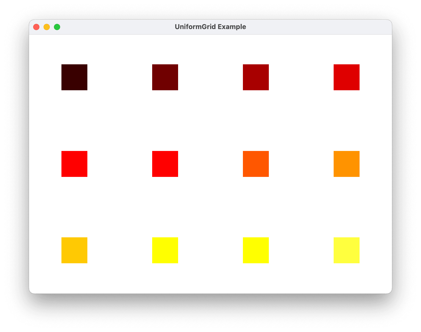
The following example demonstrates how to define and use a UniformGrid. The example creates a UniformGrid with 3 rows and 4 columns and adds 12 rectangles as child elements.
- XAML
- C#
<UniformGrid Rows="3" Columns="4">
  <Rectangle Width="50" Height="50" Fill="#330000"/>
  <Rectangle Width="50" Height="50" Fill="#660000"/>
  <Rectangle Width="50" Height="50" Fill="#990000"/>
  <Rectangle Width="50" Height="50" Fill="#CC0000"/>
  <Rectangle Width="50" Height="50" Fill="#FF0000"/>
  <Rectangle Width="50" Height="50" Fill="#FF3300"/>
  <Rectangle Width="50" Height="50" Fill="#FF6600"/>
  <Rectangle Width="50" Height="50" Fill="#FF9900"/>
  <Rectangle Width="50" Height="50" Fill="#FFCC00"/>
  <Rectangle Width="50" Height="50" Fill="#FFFF00"/>
  <Rectangle Width="50" Height="50" Fill="#FFFF33"/>
  <Rectangle Width="50" Height="50" Fill="#FFFF66"/>
</UniformGrid>
// Create the UniformGrid
UniformGrid myUniformGrid = new UniformGrid();
myUniformGrid.Rows = 3;
myUniformGrid.Columns = 4;

// Define the child content
for (int i = 0; i < 12; i++)
{
    Rectangle myRectangle = new Rectangle();
    myRectangle.Fill = new SolidColorBrush(Color.FromRgb((byte)(i * 20), 0, 0));
    myRectangle.Width = 50;
    myRectangle.Height = 50;
    myUniformGrid.Children.Add(myRectangle);
}
In the above example, each Rectangle is automatically assigned to a cell in the grid in the order they were added.