Creating a View
Let's first create a view to display a list of TODO items together with a button to add a new item.
Because this is a first tutorial, we're going to first just populate the view with some hard-coded data. In later steps we'll use the MVVM pattern to populate this view.
Our view is going to be a UserControl.
Create the UserControl
We're going to create the UserControl from a template. Follow the instructions below:
Visual Studio
- Right click your project's
Viewsfolder in Solution Explorer - Select the
Add -> New Itemmenu item - In the dialog that appears, navigate to the "Avalonia" section in the category tree
- Select "User Control (Avalonia)"
- Enter
TodoListViewas the "Name" - Click the "Add" button
.NET Core CLI
Run this command from the root directory of your project (the directory that contains "Program.cs" and the "Views" directory):
dotnet new avalonia.usercontrol -o Views -n TodoListView --namespace Todo.Views
The UserControl
The template should create a XAML file with the following contents in the Views directory, alongside MainWindow.axaml
<UserControl xmlns="https://github.com/avaloniaui"
             xmlns:x="http://schemas.microsoft.com/winfx/2006/xaml"
             xmlns:d="http://schemas.microsoft.com/expression/blend/2008"
             xmlns:mc="http://schemas.openxmlformats.org/markup-compatibility/2006"
             mc:Ignorable="d" d:DesignWidth="800" d:DesignHeight="450"
             x:Class="Todo.Views.TodoListView">
    Welcome to Avalonia!
</UserControl>
Alongside the XAML, you will also find a TodoListView.axaml.cs file containing the code-behind for the view (in Visual Studio this is nested under the XAML file so click the expander next to the XAML file in Solution Explorer to see it):
using Avalonia;
using Avalonia.Controls;
using Avalonia.Markup.Xaml;

namespace Todo.Views
{
    public partial class TodoListView : UserControl
    {
        public TodoListView()
        {
            InitializeComponent();
        }
    }
}
We're not going to touch the code-behind file for a little while, but notice that the class is called TodoListView and it's located in the Todo.Views namespace.
Edit the UserControl
Edit the contents of Views/TodoListView.axaml to contain the following:
<UserControl xmlns="https://github.com/avaloniaui"
             xmlns:x="http://schemas.microsoft.com/winfx/2006/xaml"
             xmlns:d="http://schemas.microsoft.com/expression/blend/2008"
             xmlns:mc="http://schemas.openxmlformats.org/markup-compatibility/2006"
             mc:Ignorable="d" d:DesignWidth="200" d:DesignHeight="300"
             x:Class="Todo.Views.TodoListView">
  <DockPanel>
    <Button DockPanel.Dock="Bottom"
            HorizontalAlignment="Center">
        Add an item
    </Button>
    <StackPanel>
      <CheckBox Margin="4">Walk the dog</CheckBox>
      <CheckBox Margin="4">Buy some milk</CheckBox>
    </StackPanel>
  </DockPanel>
</UserControl>
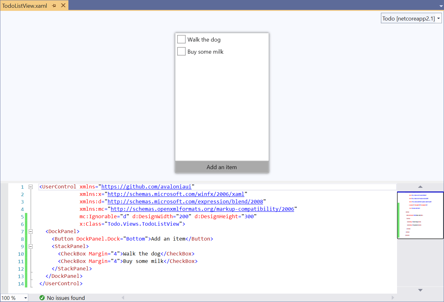
If you're using the Visual Studio extension you should see the contents of the control displayed in the previewer after completing a build:
What does it all mean?
Lets take a look at the code we just entered line-by-line.
<UserControl xmlns="https://github.com/avaloniaui"
             xmlns:x="http://schemas.microsoft.com/winfx/2006/xaml"
             xmlns:d="http://schemas.microsoft.com/expression/blend/2008"
             xmlns:mc="http://schemas.openxmlformats.org/markup-compatibility/2006">
The root element in the XAML is UserControl as could be expected. This is followed by a bunch of xmlns declarations. Each of these declares an XML namespace but the most important one is the first one: xmlns="https://github.com/avaloniaui" - this declares that the XAML in the file contains Avalonia XAML; without this entry nothing will work.
The next XML namespace is xmlns:x="http://schemas.microsoft.com/winfx/2006/xaml". This is used to import XAML features that aren't specific to Avalonia. We'll be seeing this in use later.
The following two namespaces are used to communicate designer-specific information, which is specified next:
mc:Ignorable="d" d:DesignWidth="200" d:DesignHeight="300"
mc:Ignorable="d" tells the XAML engine that entries beginning with d: can be ignored and you can pretty much ignore it too!
The d:DesignWidth="200" and d:DesignHeight="300" attributes tell the XAML designer to display the content with a size of 200x300 pixels. They're ignored at runtime.
x:Class="Todo.Views.TodoListView"
This line tells the XAML engine where the class that accompanies the XAML can be found. It's the fully-qualified name of the class. Note that this attribute is prefixed with x: - this relates to the xmlns:x entry we saw earlier.
Ok, that's the boilerplate out of the way! Now onto the meat of the code:
<DockPanel>
First we add a DockPanel as the child of the UserControl. A UserControl can only contain a single child so often the child is one of Avalonia's panel controls. Panel controls are special in that they can have multiple children.
DockPanel is a type of panel which lays out its controls at the top, bottom, left and right sides, with a single control filling the remaining space in the middle.
<Button DockPanel.Dock="Bottom" HorizontalAlignment="Center">Add an item</Button>
Now we declare the Button that appears at the bottom of the view. The DockPanel.Dock attribute tells the containing DockPanel that we want the button to appear at the bottom. HorizontalAlignment centers button in the middle of the parent. As the element content we set the button text: "Add an item".
<StackPanel>
Next we add another panel: a StackPanel. StackPanel lays out its child controls - surprise - in a stack. By default it lays out the controls vertically, but you can also make it lay out controls horizontally by setting the Orientation property, e.g. <StackPanel Orientation="Horizontal">.
Because this is the last child in the DockPanel it will fill the remaining space in the center of the control.
<CheckBox Margin="4">Walk the dog</CheckBox>
<CheckBox Margin="4">Buy some milk</CheckBox>
Last of all, we add two CheckBox controls to represent the TODO items. We're also giving the controls a margin to separate them a little bit visually.
Display the view in the Window
To see the view we've just created, we need to add it to the application's main window. Open the Views/MainWindow.axaml file and edit it to have the following content:
Views/MainWindow.axaml
<Window xmlns="https://github.com/avaloniaui"
        xmlns:x="http://schemas.microsoft.com/winfx/2006/xaml"
        xmlns:views="clr-namespace:Todo.Views"
        x:Class="Todo.Views.MainWindow"
        Icon="/Assets/avalonia-logo.ico"
        Width="200" Height="300"
        Title="Avalonia Todo">
  <views:TodoListView/>
</Window>
A lot of this is similar to the markup we've already seen, so lets just look at the interesting parts:
xmlns:views="clr-namespace:Todo.Views"
We want to display the TodoListView control we just created, which is in the Todo.Views C# namespace. Here we're mapping the Todo.Views namespace to the views XML namespace. Any control that is not a core Avalonia control will generally need this type of mapping in order for the XAML engine to find the control.
<views:TodoListView/>
Using the XML namespace we've just declared we now place the TodoListView control as the content of our Window.
Run the application
If you now run the application (by pressing F5 in Visual Studio or executing dotnet run in .NET Core) you should see the application running in all its glory:
