Fluent Theme
Introduction
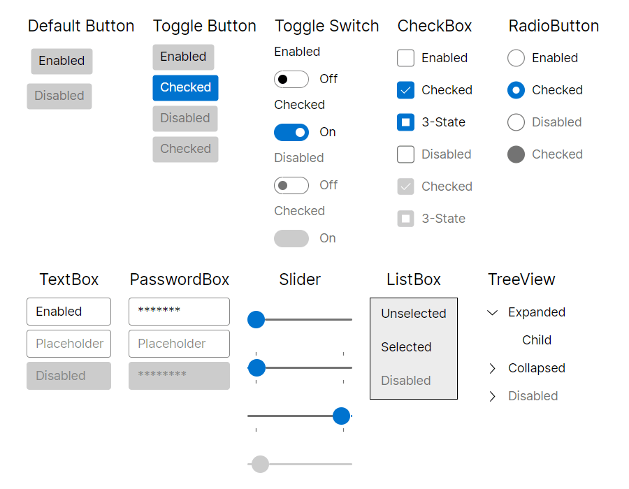
Avalonia Fluent theme is inspired by Microsoft's Fluent Design System, which is a set of design guidelines and components for creating visually appealing and interactive user interfaces. The Fluent Design System emphasizes modern, clean aesthetics, smooth animations, and intuitive interactions. It provides a consistent and polished look-and-feel across different platforms, while giving developers flexibility with our styling system.

How to use
As a first step, Avalonia.Themes.Fluent nuget package needs to be installed.
On how to add a nuget package, you can follow steps from the Nuget page or Visual Studio, Rider documentation.
After that theme needs to be included in the Application class:
<Application xmlns="https://github.com/avaloniaui"
             xmlns:x="http://schemas.microsoft.com/winfx/2006/xaml"
             x:Class="AvaloniaApplication.App">
  <Application.Styles>
    <FluentTheme />
  </Application.Styles>
</Application>
If you need to specify theme dark or light variant, please follow Theme Variants documentation.
Changing theme density
Fluent theme has two sets of predefined density variants. To switch to more compact look, you can set it with DensityStyle property:
<Application xmlns="https://github.com/avaloniaui"
             xmlns:x="http://schemas.microsoft.com/winfx/2006/xaml"
             x:Class="AvaloniaApplication.App">
  <Application.Styles>
    <FluentTheme DensityStyle="Compact" />
  </Application.Styles>
</Application>
Creating custom color palettes
While FluentTheme has build-in resources for dark and light variants, it's still possible to override base palette for these variants. It is useful, when developers want to use the same base theme, but with different colors.
To do so, you need to define
<Application xmlns="https://github.com/avaloniaui"
             xmlns:x="http://schemas.microsoft.com/winfx/2006/xaml"
             x:Class="AvaloniaApplication.App">
  <Application.Styles>
    <FluentTheme>
      <FluentTheme.Palettes>
        <!-- Palette for Light theme variant -->
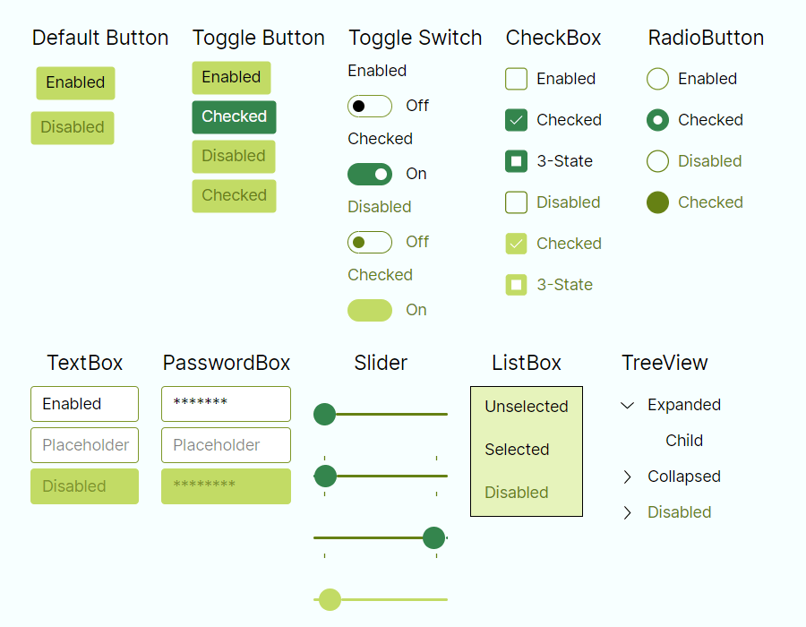
        <ColorPaletteResources x:Key="Light" Accent="Green" RegionColor="White" ErrorText="Red" />
        <!-- Palette for Dark theme variant -->
        <ColorPaletteResources x:Key="Dark" Accent="DarkGreen" RegionColor="Black" ErrorText="Yellow" />
      </FluentTheme.Palettes>
    </FluentTheme>
  </Application.Styles>
</Application>
While ColorPaletteResources has many color properties that can be overridden independently for each variant, it is possible to redefine only minimal set of what's needed, and keep everything else as per defaults. As in examples above, only a couple of colors are overridden.
If Accent is not overridden, Avalonia uses platform OS accent color if available. Also, Accent supports bindings and can be changed in runtime. But not other properties, as they are read once after app started and are statically used for performance reasons.
It is possible to build palettes from the code behind, but same rules apply - only Accent can be updated dynamically, and palettes should be
FluentTheme supports only Dark and Light theme variants, and it's not possible to define palettes for custom variants.
Creating custom color palettes with online editor
Microsoft Fluent Theme Editor was ported to Avalonia and now available to be used with our FluentTheme as well. It is available on https://theme.xaml.live/ page and supports following features:
- Editing palette colors for both Light and Dark variants.
- Previewing of the current palette.
- Exporting current palettes as XAML code that can be copy pasted into
App.axamlfile. - Saving current colors in a json file and loading it from the file system.
- Automatic hints, when palette has a low contrast between colors.
- Couple of quick start presets.
Example of FluentTheme with a Forest palette preset available on the web app:
