Tab Strip
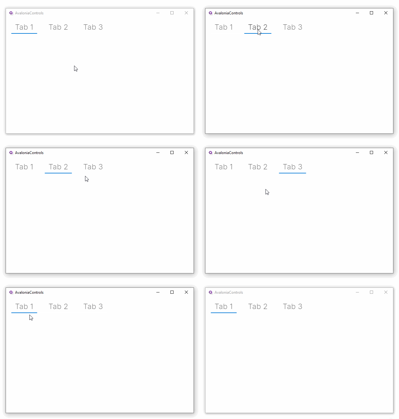
Displays a strip of tab headers. You can use this control as a horizontal menu.
The tab strip is comprised <TabItem> elements. These are displayed in the sequence that they appear in the XAML.
Useful Property
You will probably use this property most often:
| Property | Description |
|---|---|
TabItem.Header | The text for the tab. |
Example
<TabStrip Margin="5">
  <TabItem Header="Tab 1"/>
  <TabItem Header="Tab 2"/>
  <TabItem Header="Tab 3"/>
</TabStrip>
It looks like this running on Windows:

More Information
к сведению
For the complete API documentation about this control, see here.
к сведению
View the source code on GitHub TabStrip.cs