Scroll Bar
A scroll bar control can be displayed in a horizontal or vertical orientation. The default value (double) range for the scroll bar is 0-100.
You can configure the range and how the value changes (small and large steps). Small steps can be controlled by the keyboard arrow keys, and large steps by mouse clicks in the scroll bar track, or by the page-up and page-down keys.
Useful Properties
You will probably use these properties most often:
| Property | Description |
|---|---|
Orientation | The orientation of the scroll bar. |
VerticalAlignment | The vertical alignment of the scroll bar in its container. Choose from top, bottom, center and stretch. |
HorizontalAlignment | The horizontal alignment of the scroll bar in its container. Choose from left, right, center and stretch. |
To create a meaningful layout, you will need to use corresponding orientation and alignment properties. For example, a vertical orientation matches a horizontal alignment.
Example
<Panel>
  <Border Background="AliceBlue">
    <ScrollBar Visibility="Auto"
             HorizontalAlignment="Left"
             Scroll="ScrollHandler"></ScrollBar>
  </Border>
  <TextBlock Name="valueText" Margin="60">0</TextBlock>
</Panel>
using Avalonia.Controls;
using Avalonia.Controls.Primitives;

namespace AvaloniaControls.Views
{
    public partial class MainWindow : Window
    {
        public MainWindow()
        {
            InitializeComponent();
        }

        public void ScrollHandler(object source, ScrollEventArgs args)
        {
            valueText.Text = args.NewValue.ToString();
        }
    }
}
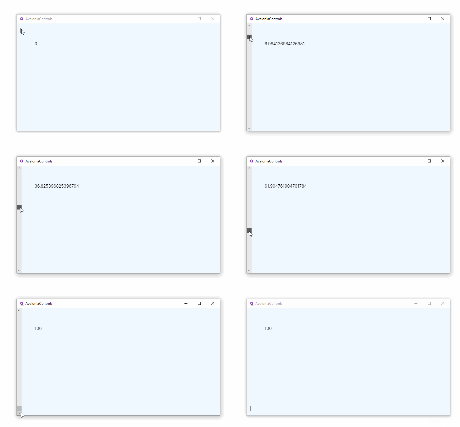
With the example code-behind, the text block displays the value of the scrollbar.

More Information
For the complete API documentation about this control, see here.
View the source code on GitHub ScrollBar.cs