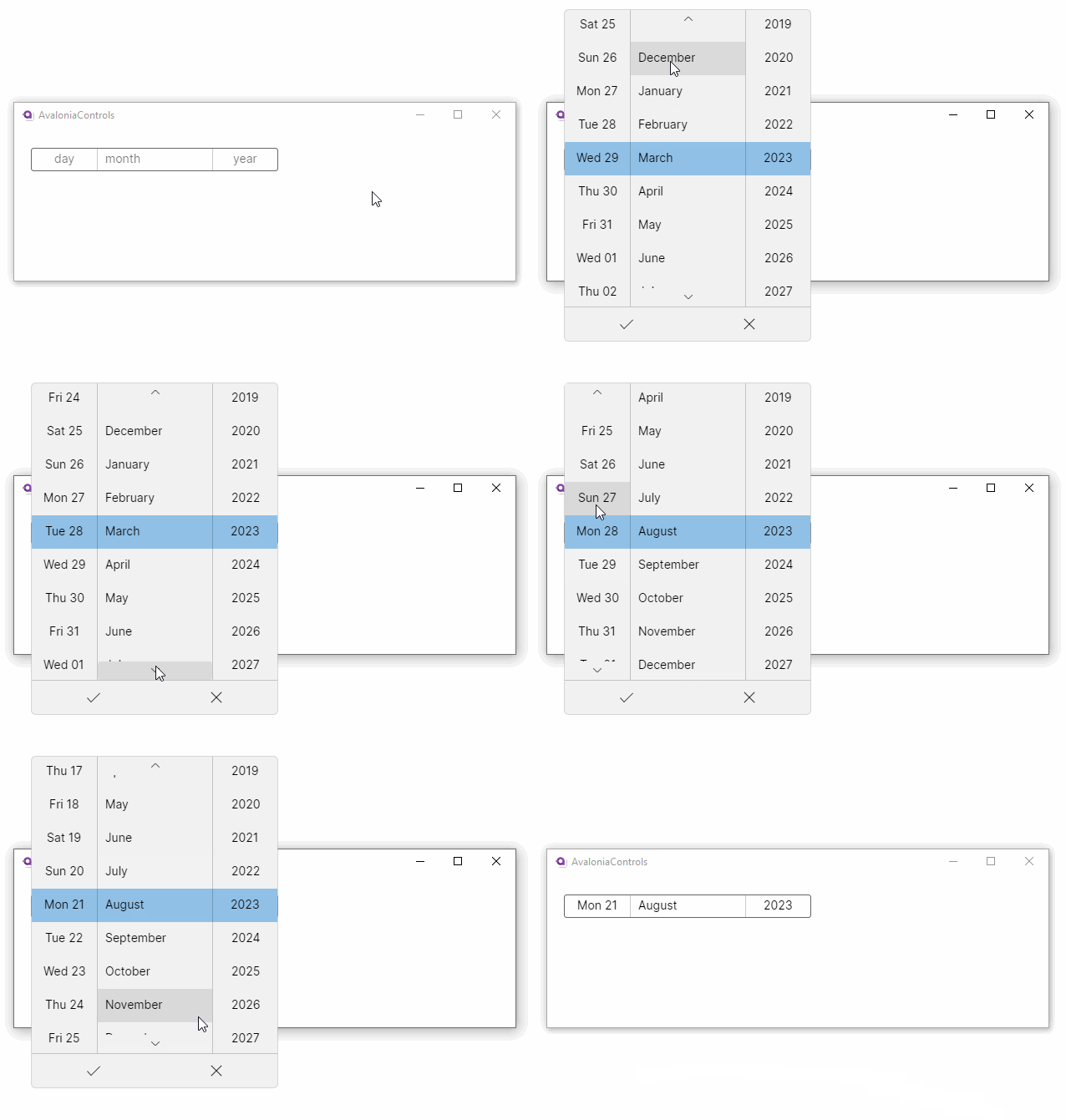
Date Picker
The date picker has three 'spinner' controls to allow the user to pick a date value. The spinners display when the control is clicked.
Useful Properties
You will probably use these properties most often:
| Property | Description |
|---|---|
DayVisible | Sets if the day column is visible. |
MonthVisible | Sets if the month column is visible. |
YearVisible | Sets if the year column is visible. |
DayFormat | Format string for the day part of the date. |
MonthFormat | Format string for the month part of the date. |
YearFormat | Format string for the year part of the date. |
SelectedDate | The date selected (null when no selection). |
Example
This example uses the date format attribute to display the name of the day as well as the number:
<StackPanel Margin="20">
  <DatePicker DayFormat="ddd dd"/>
</StackPanel>

Initializing the Date
The date properties of this control cannot be set in XAML using an attribute. This is because there is no conversion available for converting strings to date objects like DateTime and DateTimeOffset.
You will need to write code-behind like this:
datePicker.SelectedDate = new DateTimeOffset(new DateTime(1950, 1, 1));
More Information
For the complete API documentation about this control, see here.
View the source code on GitHub DatePicker.cs