Add and Layout Controls
The main window of the app will eventually show a list of album covers in the user's collection, with a button at its top-right corner to allow the user to add a new album. The button will open a search dialog window to find new albums to add.
On this page you will learn how to layout the main window so that the button appears at its top-right corner, as required.
Button Layout
To display a button in the content zone of the main window, follow this procedure:
- Stop the app if it is still running.
- Locate and open the MainWindow.axaml file.
- Inside the panel element, add the following XAML for a button. The panel XAML should look like this:
<Panel>
    <ExperimentalAcrylicBorder IsHitTestVisible="False">
        <ExperimentalAcrylicBorder.Material>
            <ExperimentalAcrylicMaterial
                 BackgroundSource="Digger"
                 TintColor="Black"
                 TintOpacity="1"
                 MaterialOpacity="0.65" />
        </ExperimentalAcrylicBorder.Material>
     </ExperimentalAcrylicBorder>

     <Button Content="Buy Music"/>
</Panel>
- Click Debug to compile and run the project.
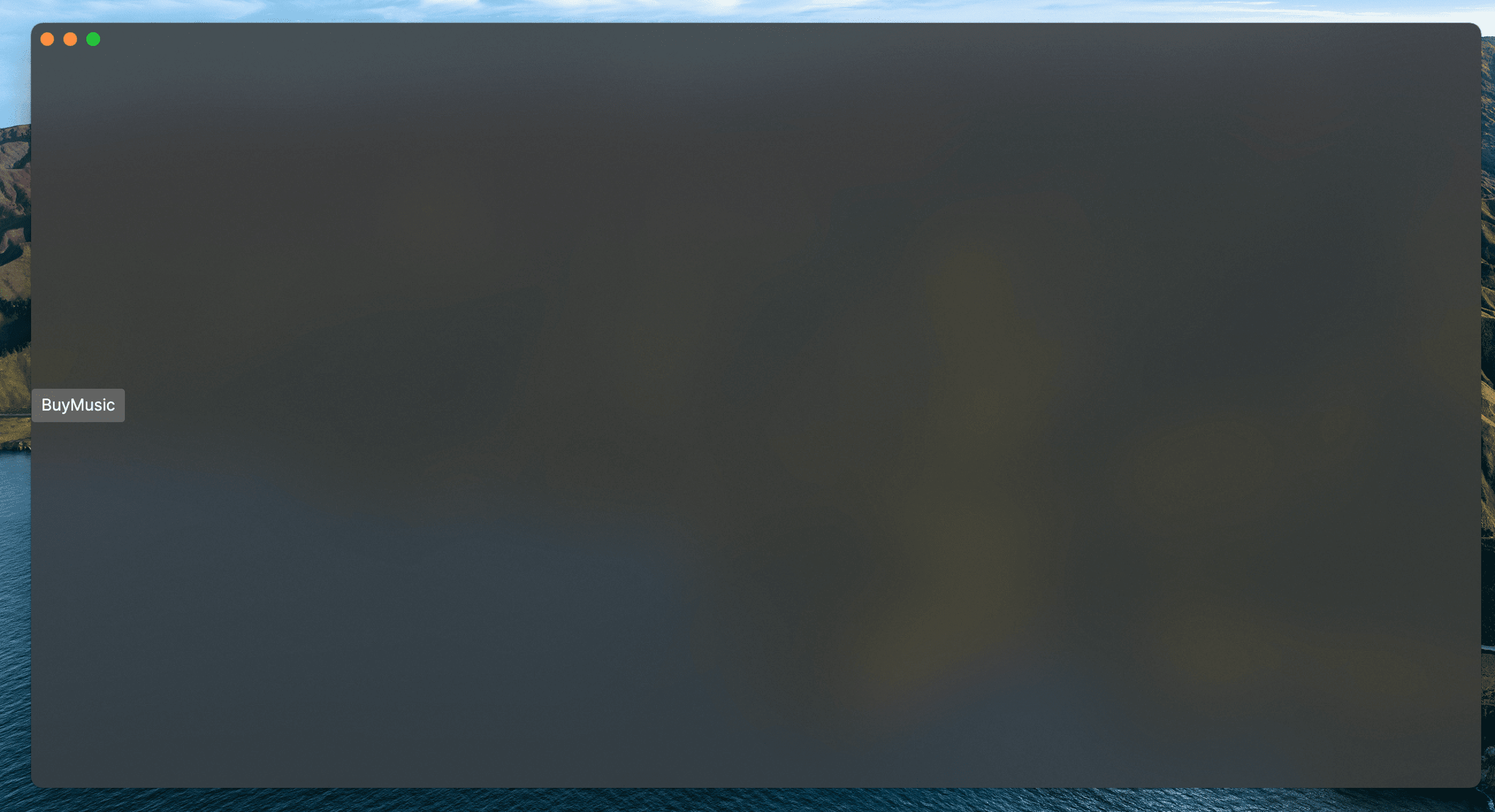
You will see the button, but it is in the default position and not at the top-right of the window as required.
Follow this procedure to position the button correctly:
- Stop the app if it is still running
- Wrap the button element in a new panel element.
- Add a margin attribute to the new panel element, with a value of 40.
- Add horizontal and vertical alignment attributes to the button element, as shown:
<Panel Margin="40">
  <Button Content="Buy Music"
     HorizontalAlignment="Right" VerticalAlignment="Top" />
</Panel>
You should see all these changes reflected in the preview pane as you add them.
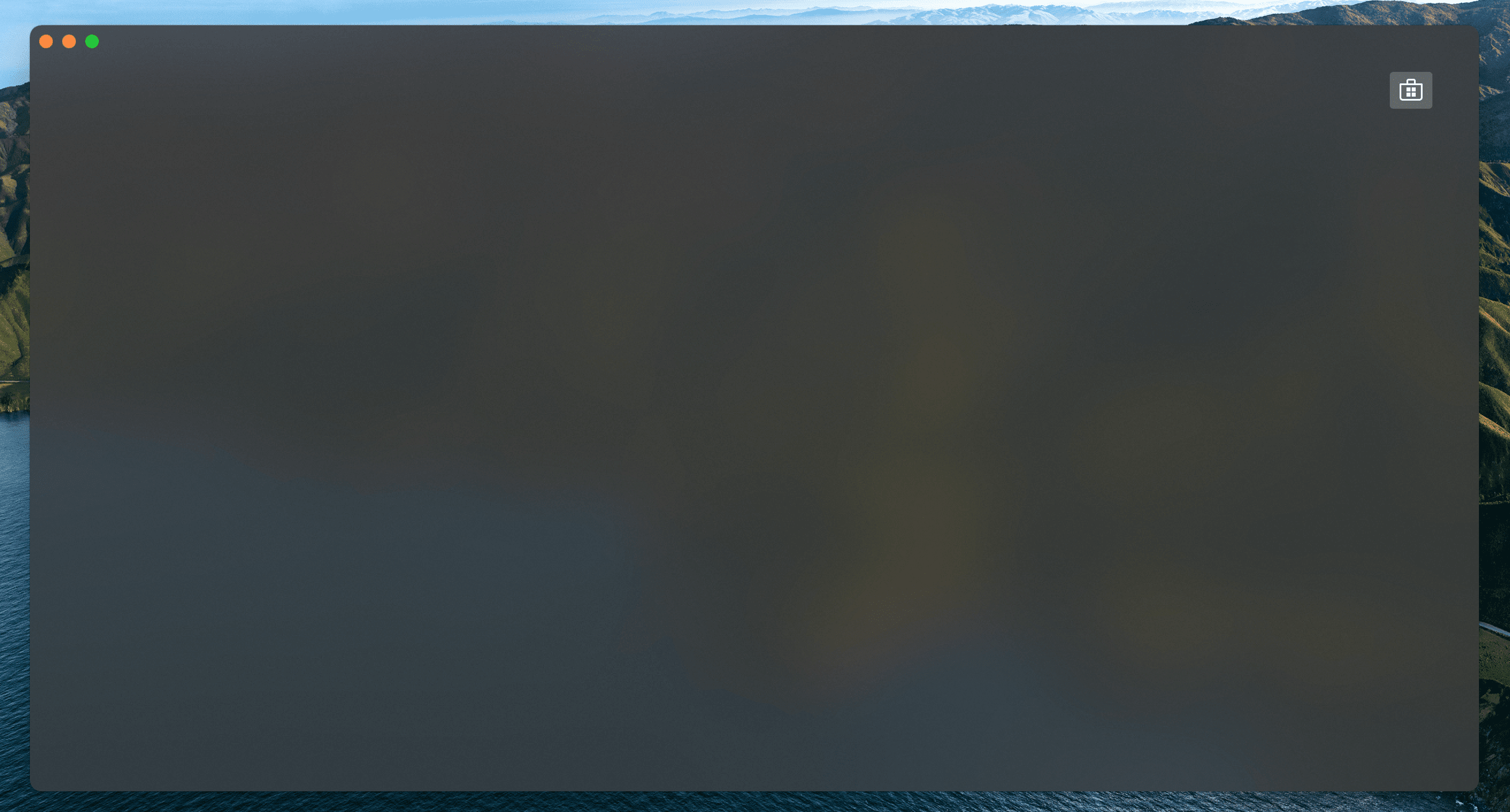
Button Icon
Have a look back at the image of the finished app here.
You will see that the button shows an icon, and not text (as it currently does). This is actually the Microsoft Store icon from the Fluent Icons collection, and Avalonia UI has definitions for all these for you to use.
To use the Microsoft Store icon, follow this procedure:
- Navigate to the Avalonia UI GitHub to find the list of Fluent Icons at https://avaloniaui.github.io/icons.html
- Use your browser's text search to locate the name of the icon 'store_microsoft_regular'. There should be some code similar to:
<StreamGeometry x:Key="store_microsoft_regular">M11.5 9.5V13H8V9.5H11.5Z M11.5 17.5V14H8V17.5H11.5Z M16 9.5V13H12.5V9.5H16Z M16 17.5V14H12.5V17.5H16Z M8 6V3.75C8 2.7835 8.7835 2 9.75 2H14.25C15.2165 2 16 2.7835 16 3.75V6H21.25C21.6642 6 22 6.33579 22 6.75V18.25C22 19.7688 20.7688 21 19.25 21H4.75C3.23122 21 2 19.7688 2 18.25V6.75C2 6.33579 2.33579 6 2.75 6H8ZM9.5 3.75V6H14.5V3.75C14.5 3.61193 14.3881 3.5 14.25 3.5H9.75C9.61193 3.5 9.5 3.61193 9.5 3.75ZM3.5 18.25C3.5 18.9404 4.05964 19.5 4.75 19.5H19.25C19.9404 19.5 20.5 18.9404 20.5 18.25V7.5H3.5V18.25Z</StreamGeometry>
- Copy all of the code for the icon.
- In the _Rider s_olution explorer, right-click the project.
- Click Add, then click Avalonia Styles
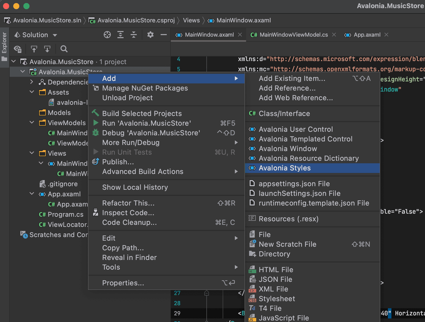
- Enter the Name 'Icons', press enter.
- Locate and open the new Icons.axaml file that is created. The XAML will look like this:
<Styles xmlns="https://github.com/avaloniaui"
        xmlns:x="http://schemas.microsoft.com/winfx/2006/xaml">
    <Design.PreviewWith>
        <Border Padding="20">
            <!-- Add Controls for Previewer Here -->
        </Border>
    </Design.PreviewWith>

    <!-- Add Styles Here -->
</Styles>
- Add a new
<Style>element with start and end tags. - Add a new
<Style.Resources>element with start and end tags inside the new<Style>element. - Paste your icon code inside the
<Style.Resources>element.
The icons file now looks like this:
<Styles xmlns="https://github.com/avaloniaui"
        xmlns:x="http://schemas.microsoft.com/winfx/2006/xaml">
    <Design.PreviewWith>
        <Border Padding="20">
            <!-- Add Controls for Previewer Here -->
        </Border>
    </Design.PreviewWith>

    <!-- Add Styles Here -->
    <Style>
        <Style.Resources>
            <StreamGeometry x:Key="store_microsoft_regular">M11.5 9.5V13H8V9.5H11.5Z M11.5 17.5V14H8V17.5H11.5Z M16 9.5V13H12.5V9.5H16Z M16 17.5V14H12.5V17.5H16Z M8 6V3.75C8 2.7835 8.7835 2 9.75 2H14.25C15.2165 2 16 2.7835 16 3.75V6H21.25C21.6642 6 22 6.33579 22 6.75V18.25C22 19.7688 20.7688 21 19.25 21H4.75C3.23122 21 2 19.7688 2 18.25V6.75C2 6.33579 2.33579 6 2.75 6H8ZM9.5 3.75V6H14.5V3.75C14.5 3.61193 14.3881 3.5 14.25 3.5H9.75C9.61193 3.5 9.5 3.61193 9.5 3.75ZM3.5 18.25C3.5 18.9404 4.05964 19.5 4.75 19.5H19.25C19.9404 19.5 20.5 18.9404 20.5 18.25V7.5H3.5V18.25Z</StreamGeometry>
        </Style.Resources>
    </Style>
</Styles>
With a new icons file prepared, you must now include it in your app.
Follow this procedure to include the icons file:
- Locate and open the App.axaml file.
- Add a
<StyleInclude>element as shown:
<Application.Styles>
    <FluentTheme />
    <StyleInclude Source="avares://Avalonia.MusicStore/Icons.axaml" />
</Application.Styles>
You need to build the application so that the icons become available to the preview pane.
To change the button from text to icon content, follow this procedure:
- Locate and open the MainWindow.axaml file.
- Alter the XAML for the button, as shown:
<Button HorizontalAlignment="Right" VerticalAlignment="Top">
    <PathIcon Data="{StaticResource store_microsoft_regular}" />
</Button>
- Click Debug to compile and run the project.
On the next page, you will learn how to link the button in the view (of the MVVM pattern) to a command in the view model, so it can act on the application logic there.