Calendar Date Picker
This is an extension of the calendar control that includes a text box and button. The calendar shows when the user clicks the button (and hides on a subsequent click). The selected date shows in the text box when a date on the calendar is clicked.
The user can also enter a date by typing in the text box. The date picker is able to process multiple date formats into the format that is displayed as a watermark when there is no selected date.
信息
For details on the calendar part of this control, see the previous reference here.
Example
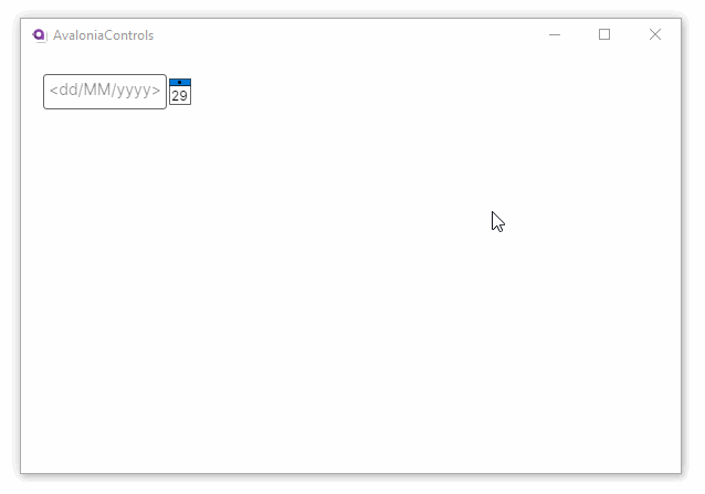
This example shows a basic single date selection calendar when the button is clicked:
<StackPanel Margin="20">
  <CalendarDatePicker />
</StackPanel>
More Information
信息
For the complete API documentation about this control, see here.
信息
View the source code on GitHub CalendarDatePicker.cs