Time Picker
The time picker has two or three 'spinner' controls to allow the user to pick a time value. The time picker can work in 24 or 12 hour formats. The picker controls display when the control is clicked.
Useful Properties
You will probably use these properties most often:
| Property | Description |
|---|---|
ClockIdentifier | Choose between 12 and 24 hour formats. The 12 hour format shows a third spinner for AM/PM. |
MinuteIncrement | Defines selectable increments for the minutes. The default is 1 (all minutes can be selected). |
SelectedTime | (Nullable TimeSpan) the selected time. |
Example
This example shows how to create a time picker for the 24 hour clock, with 20 minute time slots:
<StackPanel Margin="20" Spacing="4">
  <Label Content="Please choose your time:"/>
  <TimePicker ClockIdentifier="24HourClock"
              MinuteIncrement="20"/>
</StackPanel>
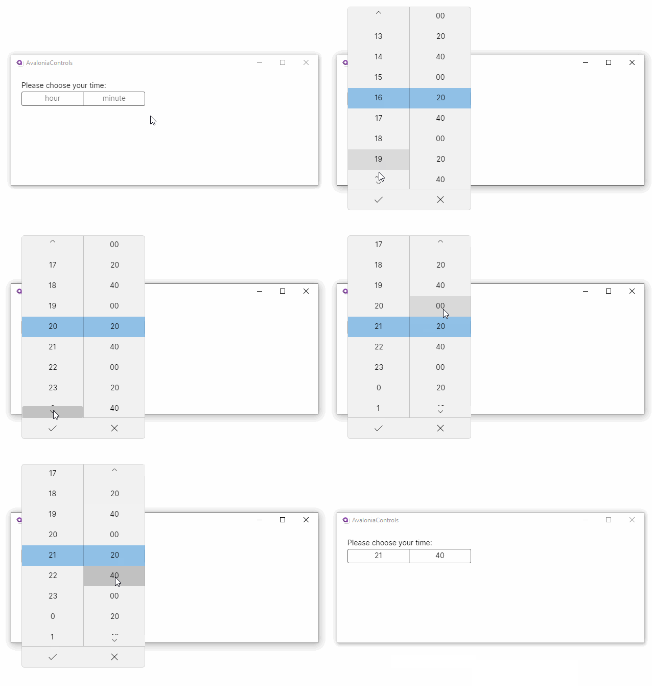
Initializing the Time
You can set the time value as an attribute in XAML. Use a string in the form Hh:Mm where Hh is hours and can be between 0 and 23 and Mm is minutes and can be between 0 and 59.
<TimePicker SelectedTime="09:15"/>
If you need to write code-behind, it can look like this:
TimePicker timePicker = new TimePicker
{
    SelectedTime = new TimeSpan(9, 15, 0) // Seconds are ignored.
};
You can clear the display by resetting the selected time to null.
More Information
For the complete API documentation about this control, see here.
View the source code on GitHub TimePicker.cs