Tree Data Grid
The tree data grid displays hierarchical and tabular data together in a single view. It is a combination of a tree view and data grid.
For full information on the tree view control, see the reference here.
For full information on the data grid control, see the reference here.
The control has two modes of operation:
- Hierarchical - data is displayed in a tree with optional columns
- Flat - data is displayed in a two dimensional table, similar to the data grid control
Hierarchical Data
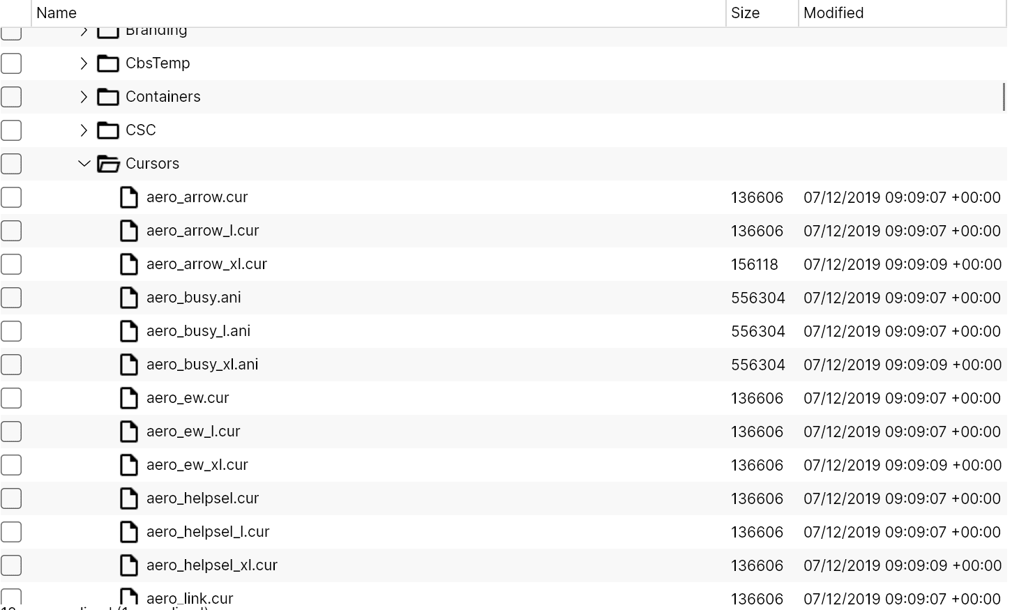
This is an illustration of a tree data grid displaying hierarchical data:

Flat Data
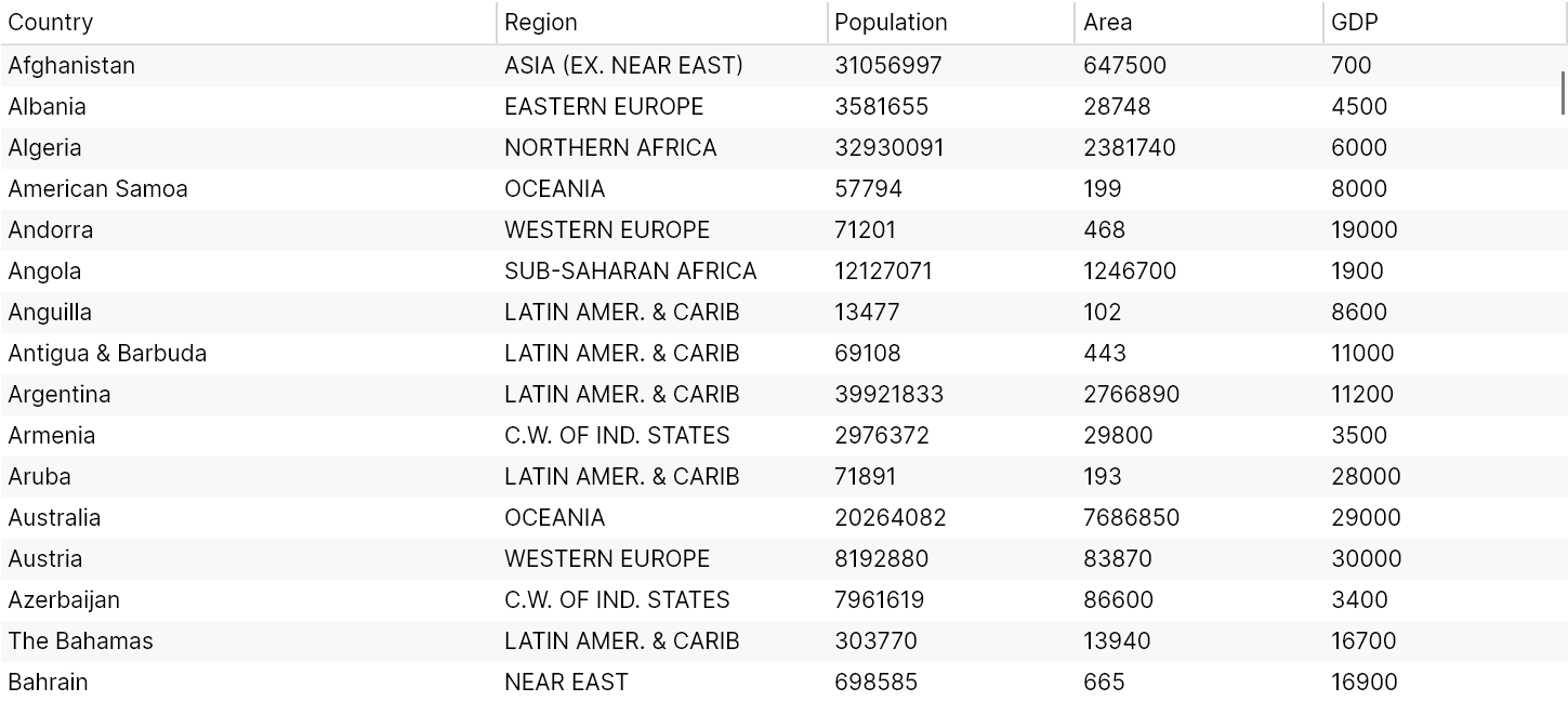
This is an illustration An example of a tree data grid displaying flat data:

NuGet Package Reference
You must install the NuGet package for the data grid, there are several ways of doing this. You can use Manage NuGet Packages from the project menu of your IDE:
Alternatively, you can run this instruction from the command line:
dotnet add package Avalonia.Controls.TreeDataGrid
Or add package reference directly to the project (.csproj) file:
<PackageReference Include="Avalonia.Controls.TreeDataGrid" Version="11.0.0" />
Note you must always install the data grid version that matches the Avalonia UI version you are using.
Include Data Grid Styles
You must reference the data grid themes to include the additional styles that the tree data grid uses. You can do this by adding a <StyleInclude> element to the application (App.axaml file).
For example:
<Application xmlns="https://github.com/avaloniaui"
             xmlns:x="http://schemas.microsoft.com/winfx/2006/xaml"
             x:Class="AvaloniaApplication.App">
  <Application.Styles>
    <FluentTheme/>
    <StyleInclude
        Source="avares://Avalonia.Controls.TreeDataGrid/Themes/Fluent.axaml"/>
  </Application.Styles>
</Application>
Useful Properties
You will probably use these properties most often:
| Property | Description |
|---|---|
Source | The bound collection that is used as the data source for the control. |
CanUserResizeColumns | Indicates whether the user can adjust column widths using the pointer. (Default is false.) |
CanUserSortColumns | Indicates whether the user can sort columns by clicking the column header. (Default is true.) |
Source
You will use the Source property to bind to a view model that is defined in code. The view model includes the definition of how the columns map to the properties of the class that holds the grid items.
More Information
For the complete API documentation about this control, see here.
View the source code on GitHub TreeDataGrid.cs
The next page shows an example of creating a hierarchical tree data grid with columns.